Detail panel
Every card in Compass — an Objective, Key Result, Opportunity, Solution, Assumption, Experiment, Roadmap item, Task, or piece of Feedback — opens a detail panel when you click its title. The panel slides in from the right, over whatever screen you're on, so you can look at (and edit) something without losing your place. It's the same panel everywhere: on the boards, on the OKRs page, on the Tasks board and list, and on Canvas (where you click a node).
Opening it
- Click a card's title on any board or list — OKRs, Discovery, Experiments, Roadmap, Tasks, or Feedback.
- Click a node on Canvas.
- Press Escape, click the ✕, or click outside the panel to close it.
What's inside
Each panel shows the essentials for that item — its status, key fields, and the things it's connected to:
| Item | Shows |
|---|---|
| Objective | Status, cycle, and its Key Results. An Objective with no cycle shows No cycle / Persistent as its cycle (on Torres workspaces a cycle is shown only when there is one) |
| Key Result | Progress, its Objective (with a Move to another objective… picker, see OKRs), any supporting Objectives, and any linked Opportunities and Roadmap items. On Opportunity-first and Torres workspaces it also has a read-only Linked Solutions list (each row opens that solution) |
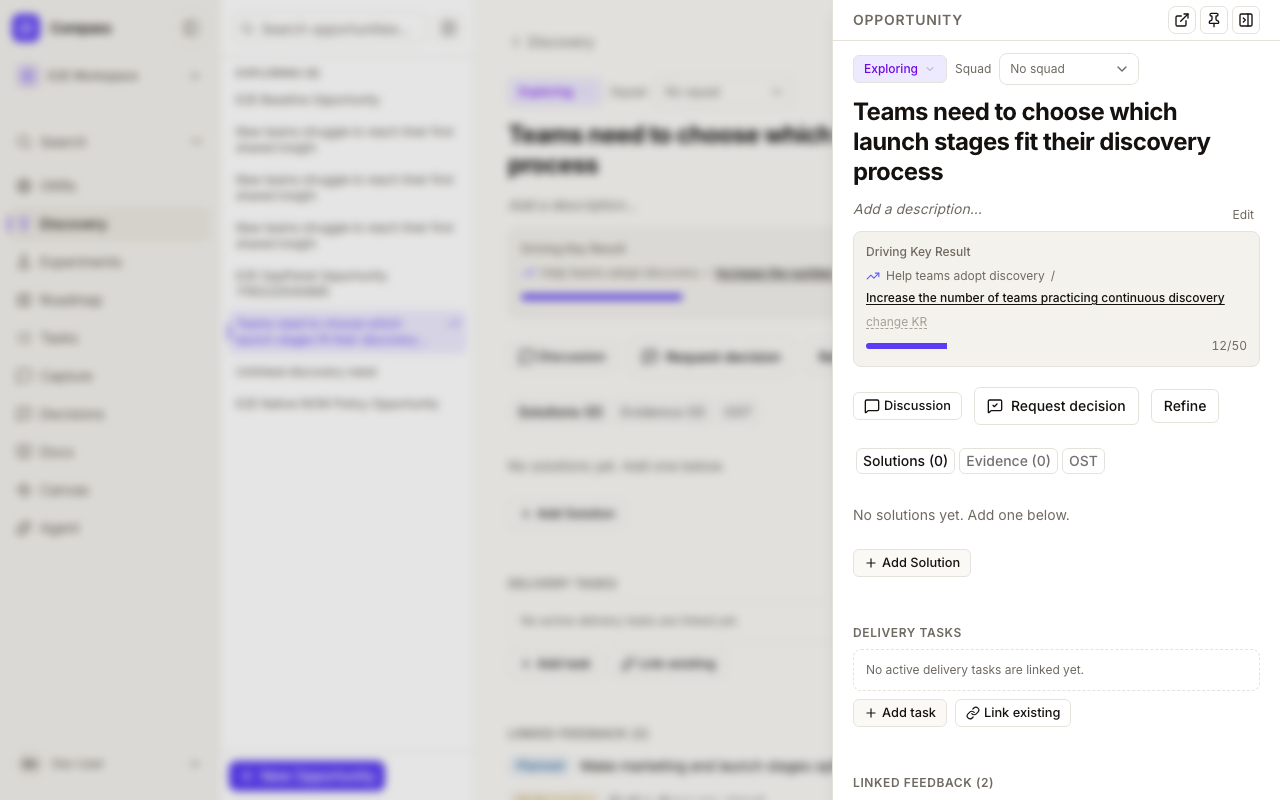
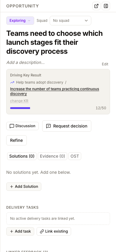
| Opportunity | The shared full-page detail: editable header, Key Result, Solutions, Evidence, OST Tree, configured scoring/custom fields, feedback, delivery tasks and Discussion. On Opportunity-first and Torres workspaces the header also has an Objectives (Outcomes) box listing the Objectives it is linked to, with a Change control to add or remove them |
| Solution | Status, its Opportunity, assumptions, and roadmap links. On Opportunity-first and Torres workspaces it also has a Linked Key Results box (Linked Success metrics under Torres) where you tick or untick the Key Results the solution is meant to move; each tick saves immediately |
| Assumption | Status, risk level, its Solution, and experiments |
| Experiment | Status, kill condition, the assumption it tests, and results |
| Roadmap item | The shared full-page detail: editable title, horizon, squad and dates in one summary row, votes and a Private chip, delivery tasks, launch checklist (when enabled), linked records, measurements, configured custom fields and Discussion |
| Task | Status, priority, assignee, owner, squad, subtasks, and everything it's linked to |
| Feedback | Type, status, votes, linked Opportunity, and attachments |
See Tasks for what's specific to Task's fields — Epics/Subtasks, Owner, and Iteration.
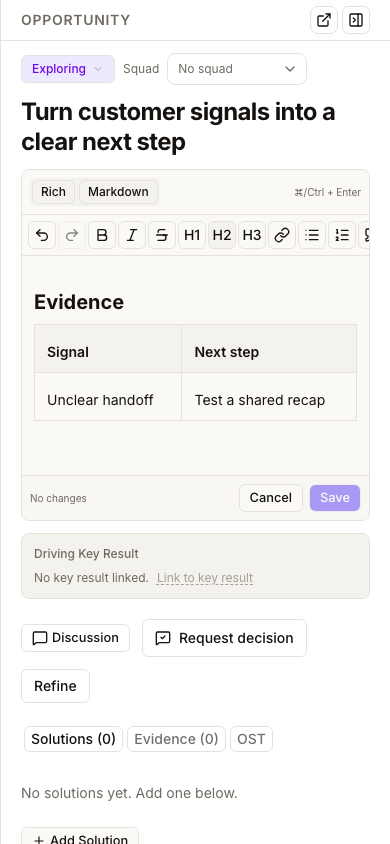
Opportunities use one responsive detail view in both the panel and full page. The available width controls the layout: Discussion appears beside the tabs on a wide surface and below the content in a narrow panel or phone. The header's Discussion shortcut jumps to it. Tabs and comment actions are the same in both surfaces; resizing does not reset your comment draft.
Discuss work in context
Every one of these nine panels includes a shared Discussion. Use it for working notes, questions, and follow-up that should stay attached to the item.
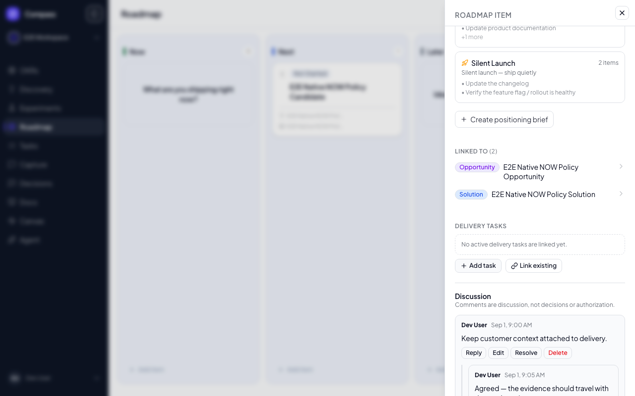
- Add a comment or reply once to a root comment. Replies stay grouped in chronological order; threads are intentionally one level deep.
- Edit or delete your own comments. Workspace and organization administrators can moderate any comment.
- Resolve a finished thread to collapse it, then reopen it if the conversation needs to continue.
- A root with replies cannot be deleted as a single comment. An administrator can delete the whole thread only after confirming that every reply will also be removed.
- Comments posted by an agent are labeled Agent, and changed comments show Edited.
Anyone who can access the workspace can read and participate in its discussions. Items outside your workspace remain inaccessible.
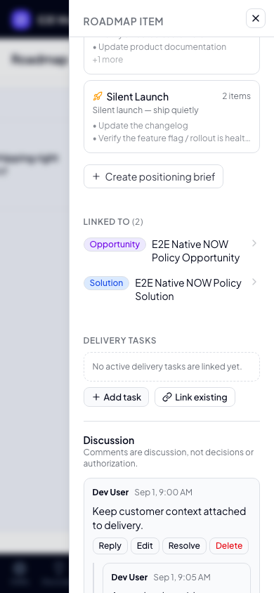
On a phone, the panel and Discussion fill the available width while keeping the same actions:
Comments are not decisions
A comment records conversation; it does not approve work, authorize a release, or change an item's lifecycle. Use Decisions when a named person must choose or authorize something.
Solutions have one additional, specialized surface: Current Plan. Plan updates remain separate from ordinary Discussion comments so the current proposal can stay pinned and retain its Approve/Reject workflow without duplicating conversation.
Shared Discussion covers the nine detail panels above. A follow-up release will bring the same model to Docs, Artifacts, Research Studies, and tracked Decision reviews; their existing specialized experiences remain unchanged for now.
Jump between related items
The linked items in a panel are clickable. Open an Objective, click one of its Key Results, and the panel switches to that Key Result — from there click an Opportunity it drives, and so on. This lets you walk your whole opportunity-solution tree without leaving the panel or losing the thread. The browser back button steps back through the items you visited.
An Opportunity's Driving Key Result title and Linked feedback rows open the corresponding panels. Linked feedback includes a count and status labels; it is distinct from Evidence. These same navigation controls are also available on the opportunity's full page.
Edit in place
You don't have to open the full page to make a quick change. In the panel you can:
- Change the status (or a Roadmap item's horizon) from the dropdown at the top.
- On a Roadmap item, set the squad and dates from the summary row, and the linked Opportunity and Private visibility under More properties.
- Rename an item — click its title and type.
- Edit the description — select Edit beside it to open the Markdown editor. Use Rich for formatted writing or Markdown to edit the source directly.
Titles save with Enter; Escape cancels a title edit. Descriptions use explicit Save and Cancel actions: clicking away never saves. Press ⌘ Enter on Mac or Ctrl Enter on Windows/Linux to save a changed description. A failed save keeps your draft and shows an error so you can retry.
The description toolbar supports undo/redo, bold, italic, strikethrough, headings, links, bulleted and numbered lists, quotes, inline code, code blocks, horizontal rules, and tables. Scroll the toolbar horizontally in a narrow panel or on your phone. Switch modes to inspect the Markdown behind your formatting.
Place the cursor in a table to add or delete rows and columns. Table cells support one paragraph each; edits that would require unsupported Markdown table structure are not applied, and the editor explains why.
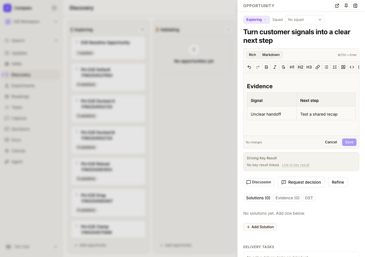
Descriptions containing raw HTML, images, task lists, footnotes, or code-fence metadata open in source mode with Rich disabled, preserving content the rich editor cannot safely represent. Images and raw HTML are not displayed in rendered descriptions. Source edits retain your Markdown; saving continues to trim outer whitespace, and an empty description clears the field.
The same editor is available on full-page Tasks, Opportunities and Roadmap items. Creation forms retain their compact text fields.
For anything deeper, use Open full page at the top of the panel.
Task, opportunity and roadmap item panels keep Open full page as a compact icon beside the pin and close controls, in both floating and pinned panels. Their compact summary puts status, priority, assignee, and due date below the title; expand More properties below subtasks for the remaining task fields.
Roadmap items use one responsive detail view in the panel and on their own full page (Open full page goes to /roadmap/<item>). Container width, not the screen, decides the layout: Discussion sits beside the content on a wide surface and below it in a narrow panel or on a phone, and the Discussion shortcut jumps to it. Everything saves as you change it, and the board card updates behind the panel. See Roadmap.
Shareable links
The open panel is reflected in the page's web address, so you can copy the URL and share it — whoever opens it lands on the same screen with that item's panel already open. Refreshing the page keeps it open too. (Only people who are members of the workspace can open it — the panel never exposes items from a workspace you're not in.)
Not yet available
- Clicking a card anywhere on it — for now the title is the click target; the rest of the card keeps its existing behavior (drag to reorder, quick-action menus).
- A docked, resizable panel that sits beside the content instead of over it — planned for a future update.