Docs
The Docs section brings Markdown Docs, Diagrams, and Artifacts together in one Library. Use Docs for PRDs and research notes, Diagrams for visual thinking, and Artifacts for prototypes and other solution deliverables.
The Library mixes root items alphabetically, keeping child pages beneath their parents. Search Find in library across titles, or use All, Docs, Diagrams, and Artifacts to narrow the list. Matching nested items keep their parent context visible. Search, filters, and New stay above a single scrolling list, including on mobile.
Use New to create a doc, create a diagram, import a .canvas file, or add an artifact.
The Library lives in the agent sidebar, not in a sidebar of its own. Click the Show library button (the library icon) beside the page title in any Docs page, diagram, or artifact to open the agent sidebar on its Library view; click it again to close the sidebar. You can also switch to Library from the sidebar's own view switcher at any time, from any screen. Opening an item loads it in the main area and leaves the sidebar where it is, and the sidebar keeps your agent conversation running while you browse. Its width, and whether it is open, are remembered in this browser. On narrow screens the sidebar opens as an overlay.
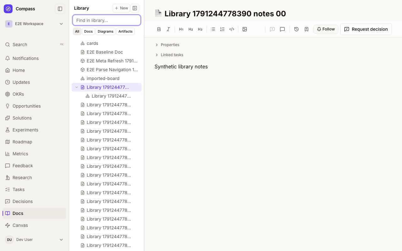
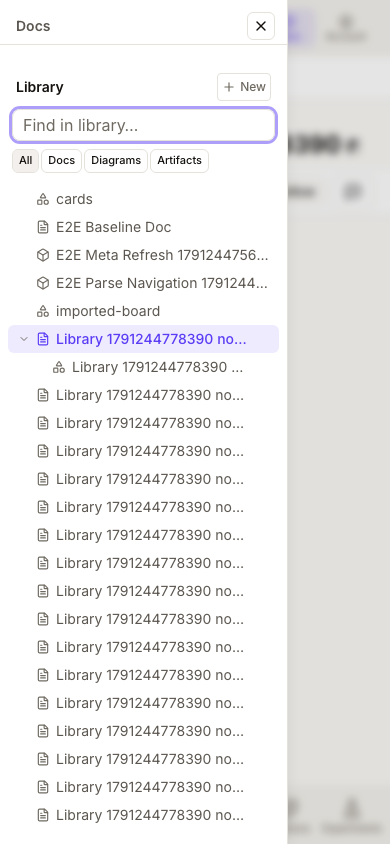
These Library illustrations use synthetic content in an isolated component harness. They show the shared navigation component; full workspace behavior is covered separately by functional tests.
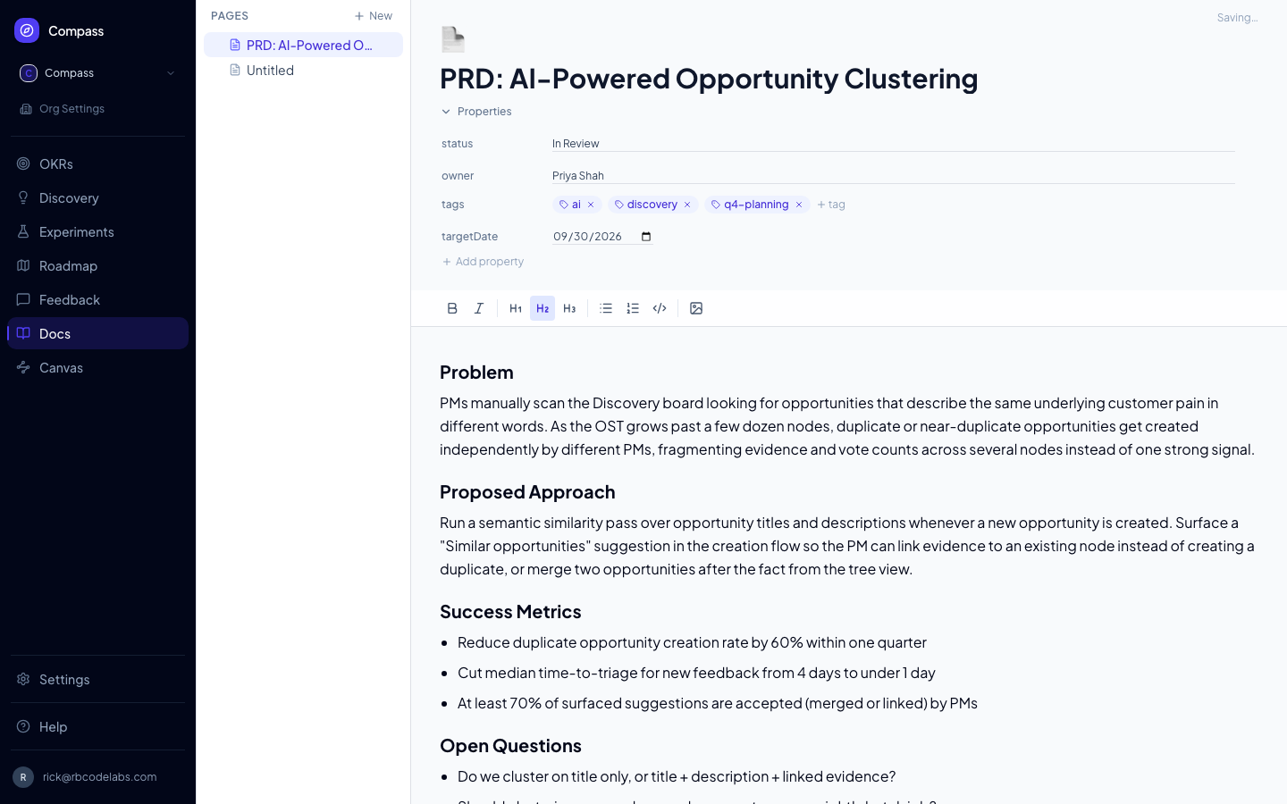
📸 Screenshot: run
pnpm docs:screenshotswith aDOCS_SESSION_FILEto capture this image.
Page Hierarchy
Documents are organised as a tree. Each page can have child pages nested beneath it. The Library (in the agent sidebar) shows your full tree. Click any page title to open it, or click the + icon next to a parent page to create a child page.
Drag a page from the Library onto a diagram to add a live Compass card.
Artifacts
Deployed HTML Artifacts require ARTIFACT_BLOB_READ_WRITE_TOKEN for a private Vercel Blob store. Configure separate stores and credentials for production and preview. Uploads, reads, and cleanup use this credential explicitly; Compass never falls back to the general BLOB_READ_WRITE_TOKEN, which can serve public images. Missing configuration blocks HTML storage operations with “Private artifact storage is not configured.” An incorrectly configured public store is rejected by Vercel. Local database-backed development uses filesystem storage.
When upgrading an existing installation, point this credential at the private store that already contains its Artifact revisions, or migrate those files before switching stores. Revisions retain storage paths, so changing the credential alone does not move existing files.
Artifacts have stable identities and appear alongside Docs and Diagrams in the Library. They are not nested into the Page hierarchy. An Artifact can be linked to multiple Solutions, and a Solution can link to multiple Artifacts.
Artifacts can also be linked to ordinary Decisions. Open a Decision and use Artifact to link under Linked to to choose an active Artifact in the same workspace. The row opens its current preview and shows its current revision and archived status. The Artifact detail page lists reciprocal Linked decisions, where a workspace member can remove a link. Existing archived links stay visible and removable, but archived Artifacts cannot be newly linked.
These relationships are live supporting material, not frozen approval evidence. Replacing an Artifact revision changes the current preview without reopening a Decision or changing its original subject, captured Sources, history, or recorded outcome. Links remain across Decision revisions. They are available on pending and decided ordinary Decisions, not legacy execution-authorization reviews. Only workspace members can edit the links; organization-admin-only Decision readers do not gain Artifact editing access.
Choose one source when creating an Artifact:
-
Upload HTML — one self-contained
.htmlfile up to 2 MB. CSS, images, fonts, and JavaScript must be embedded in the file. -
External link — an
httporhttpsURL. Compass stores the link but never fetches or proxies the external page. -
Google Drive link — an external link to a Google Doc, Sheet, Slides deck, Form, Drive file, or Drive folder is recognised automatically and labelled (for example "Google Doc"). Compass still stores only the URL, never the file's contents. The Artifact page shows a read-only preview in Google's own viewer, running as you: you see the file only if your Google account has access, and otherwise Google shows its sign-in or request-access page. Some browsers block third-party cookies in frames and show a sign-in page even when you have access, so an Open in Google link is always shown. Google Forms are not previewed in place (a Form's viewer is submittable). Drive links are not screenshotted, because the capture browser cannot sign in to Google.
-
v0 chat — a v0 chat link (
https://v0.app/chat/<id>, or the longer team link copied from the address bar). Compass reads the chat from v0 using your own v0 connection (connect v0 first under Settings → My agents) and records it as revision 1; the title is optional and defaults to the chat name. On the Artifact page, Refresh from v0 re-reads the chat and adds a new revision only when v0 has a new version, otherwise it reports that the Artifact is already up to date. Agents can do the same withcreate_artifact(sourceType: "V0_CHAT") andrefresh_artifact_from_v0.When v0 has a running preview of the chat, the Artifact page shows it live above the link card. The preview is served through Compass from a separate preview host (
V0_PREVIEW_HOST, attached to the same deployment) so the generated app never shares an origin with Compass, and it is readable only with the short-lived, encrypted ticket embedded in that page's frame address (V0_PREVIEW_TICKET_KEY, up to one hour). If either setting is missing, or your v0 connection cannot fetch a preview, the page falls back to the link card. An expired preview shows “This preview has expired” — reload the page for a fresh one. Navigation that the previewed app does with client-side routing (without a page load) can lose the ticket; reload to return to the start.
Uploaded HTML runs in an opaque-origin preview with the exact allow-scripts sandbox permission. Its injected policy denies fetch/XHR/WebSocket connections, forms, embedded frames, workers, objects, parent-page access, popups, downloads, and top navigation. Before any uploaded byte runs, a non-privileged trusted bootstrap establishes an authenticated readiness and navigation signal with Compass. The iframe stays hidden until readiness is verified; navigation signals or a missing handshake replace the frame with a warning, including parse-time redirects and zero-delay meta refreshes. The bootstrap token grants no parent capability and its script removes itself before uploaded code runs. Files are stored privately. External links are clearly labeled and open in a new tab.
Replacing an Artifact creates an immutable revision and advances the current preview without changing the Artifact ID or breaking its Solution links. The detail screen shows revision history and lets workspace members edit metadata, link or unlink Solutions, replace the current revision, or archive the Artifact. Archived Artifacts disappear from the default navigator while their history and links remain preserved.
Artifact comments
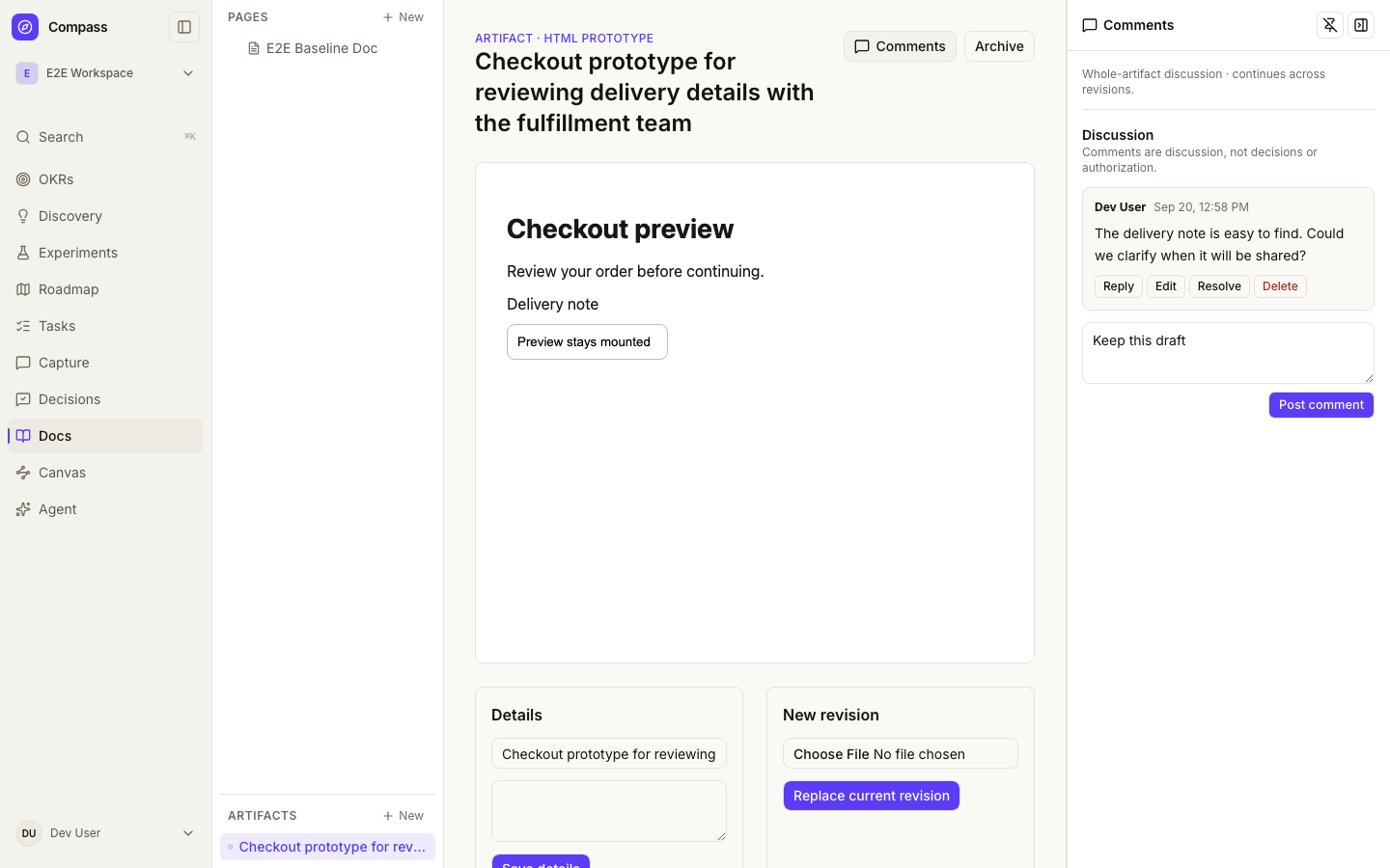
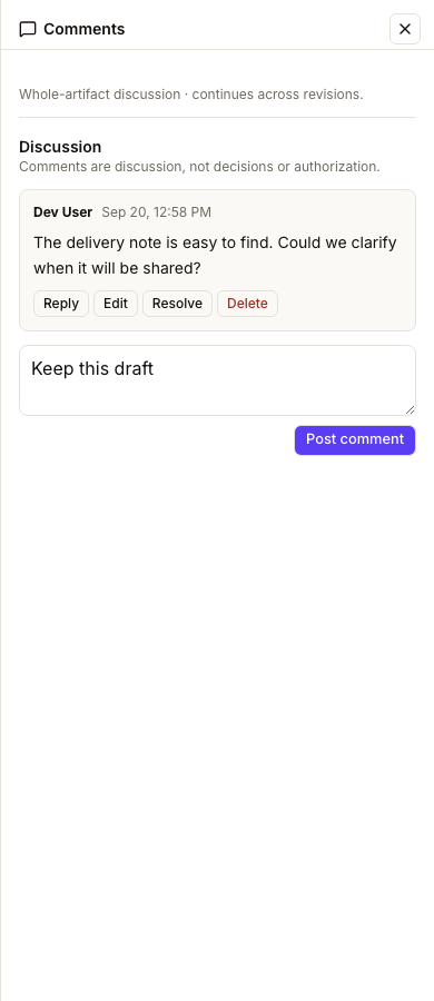
Open Comments on an Artifact to discuss the whole prototype or external reference. Comments support Markdown, one-level replies, editing, deletion, and resolving/reopening threads. Human and agent authors are identified. Comments stay with the Artifact across revisions; they are not pinned to coordinates or a particular revision, and never constitute approval or authorization. Existing discussions remain available on archived Artifacts.
On a wide screen, choose Pin panel to keep the discussion beside the preview. Drag the divider or use its arrow keys to resize it. Artifact Comments remembers its own pin preference and width independently of Page Comments, Version History, and object detail panels. Narrow viewports—or a content row too narrow to leave 480px for the preview—use an overlay without changing that preference.
Closing, reopening, pinning, or changing screen size preserves unfinished comments and replies while you remain on the same Artifact. Reopening refreshes the discussion. Navigating to another Artifact or reloading the page clears unsent drafts. Escape cancels an active edit or reply first; otherwise it closes the focused panel. Interacting with the preview does not dismiss a pinned discussion.
The Editor
Docs uses a Tiptap-powered rich-text editor. Supported formatting includes:
- Headings — H1, H2, H3 via the toolbar or by typing
#,##,###at the start of a line - Lists — Bulleted (
-or*) and numbered (1.) - Bold / Italic / Underline — Via toolbar buttons or
Cmd+B,Cmd+I,Cmd+U - Code blocks — Inline code with backticks, fenced code blocks with triple backticks
- Links — Select text and click the link button to add a URL
- Horizontal rules — Type
---on a blank line - Blockquotes — Start a line with
> - Tables — GitHub-flavored Markdown pipe tables (
| a | b |with a| --- | --- |separator row). Column alignment (:---,:---:,---:) is preserved, and a literal|inside a cell must be escaped as\|. Wide tables scroll horizontally within the page rather than stretching the layout. There are currently no toolbar controls for inserting or editing tables — write them as Markdown, or paste Markdown in.
Decisions in the toolbar
Use Request decision on the right of the editor toolbar to start a decision with this page already selected. While a decision about the page is pending, the same control shows Decision pending and a request count. Click it to open the existing decision. If several requests are pending, Decisions pending opens a menu of their questions, newest first.
The count includes only pending decisions whose primary subject is this page, not decisions that merely cite it as supporting material. Recorded decisions leave the count; a revised pending request appears again. To start an additional decision, use New decision in Decisions. If status cannot be loaded, Decision status unavailable links to Decisions while the editor remains usable.
Inserting Screenshots
Click the image icon in the toolbar to upload a screenshot. You can also paste an image from the clipboard directly into the editor — Compass will upload it automatically and embed it inline.
New uploads accept PNG, JPEG, GIF, or WebP images up to 10 MiB. Compass stores them in the private Artifact Blob store and serves them through a workspace-authorized Compass URL, so the viewer must be signed in as a member of that workspace. Deployments must configure ARTIFACT_BLOB_READ_WRITE_TOKEN; Compass does not fall back to the public Blob store.
Images uploaded before workspace-private storage was introduced keep their existing public Vercel Blob URLs so old documents continue to render. Those legacy URLs remain accessible to anyone who has the URL. This upgrade does not copy or delete blobs or rewrite existing documents; retroactively privatizing them requires a separately planned migration.
Page Properties
Above the editor, a collapsible Properties panel lets you attach arbitrary key/value metadata to a page — similar to frontmatter. Click Properties to expand it, then + Add property to create a new entry.
- String-array values render as removable tag chips — type a value and press Enter or
,to add another. - Any property whose key contains
date,created,updated, ormodified(or ends inat), or whose value already looks like a date (YYYY-MM-DD), gets a date picker input instead of a plain text field. - Click a property's key to rename it inline.
Like the rest of the editor, properties autosave about 800ms after you stop typing — there's no manual save button.
Auto-save
The editor auto-saves your changes every few seconds. There is no manual save button. The last saved timestamp appears at the top of the editor. You can safely close the tab and return — your work is preserved.
Version History
Every page keeps a history of past versions, so you can always see what changed or recover earlier content.
Automatic snapshots. Right before an edit overwrites a page's title, content, or icon, Compass saves a snapshot of what was there before — you never have to think about it. To avoid flooding the history while you're actively typing (the editor autosaves ~1.2 seconds after you stop), snapshots from the same author within a 5-minute window are coalesced into one: you get a snapshot of what the page looked like before you started that editing session, not one per keystroke-driven autosave.
Named snapshots. Click the bookmark icon in the toolbar to save a snapshot on demand, optionally with a label (e.g. "Before rewrite"). Named snapshots always save immediately and are never coalesced away, even if you just saved one seconds ago.
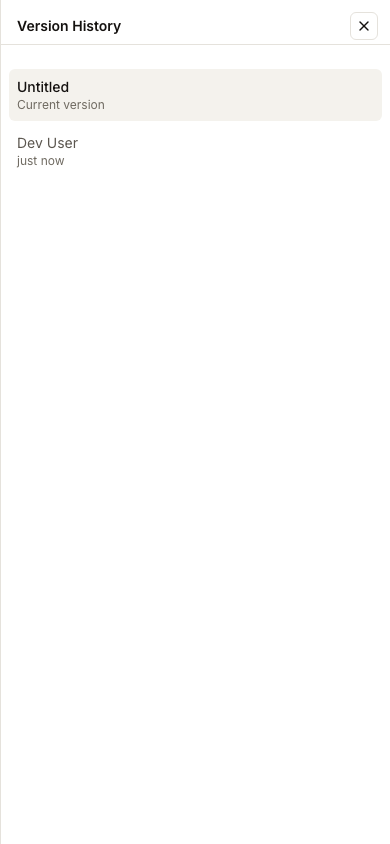
Viewing history. Click the history icon in the toolbar to open the Version History panel. It lists every saved version — author, relative time (e.g. "12 minutes ago"), and label if one was set. Click a version to see a diff of its content against the page's current content, with additions and deletions highlighted.
Restoring. Each version has a Restore button. Restoring asks for confirmation, since it overwrites the page's live content — but nothing is ever actually lost: the page's current state is automatically saved as a new version (labeled "Before restore") right before the restore happens, so you can always undo a restore by restoring again.
Version history is also available over MCP — see MCP API for create_doc_version, list_doc_versions, get_doc_version, and restore_doc_version.
Pinning Docs panels
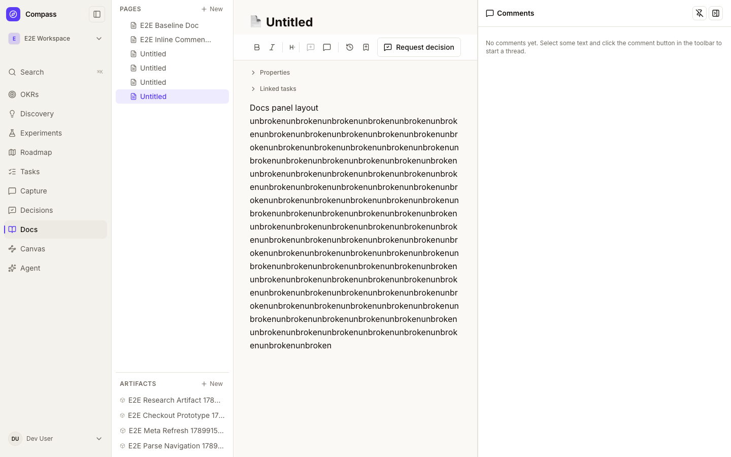
Comments and Version History open as overlays by default. On a wide screen, use Pin panel in either header to dock it alongside the editable page. Only one Docs panel opens at a time; opening the other replaces it. Unpin panel returns to the overlay.
Drag the left divider to resize a pinned panel, or focus the divider and use the arrow keys (Shift for larger steps), Home, or End. Each panel remembers its own pin preference and width across reloads. Panels range from 320–720px, while the editor keeps at least 480px. If the window is below 1024px or the Docs row cannot fit both, the panel temporarily becomes an overlay; widening the window restores the preference.
Use Close panel, or press Escape while focused inside a pinned panel, to close it. Escape in the editor leaves the docked panel open. Restoring a version keeps pinned History open; an overlay closes after restoration.
Inline Comments
Leave Google-Docs-style comments anchored to a specific span of a page, so discussion stays attached to the exact text it's about.
Adding a comment. Select any text in the editor, then click the comment icon (the speech bubble with a plus) in the toolbar — it only lights up once you've selected something. A small composer appears; type your comment and click Comment (or press ⌘/Ctrl+Enter). The commented text is highlighted in the page, and the comment opens in the Comments sidebar.
The highlight is never saved into your content. Comments are stored separately and the highlight is drawn on top at display time — your page's markdown stays exactly as you wrote it. That also means a comment survives edits: as you rewrite around it, Compass re-locates the anchored text and keeps the highlight in place.
Orphaned comments. If the text a comment was anchored to is deleted or changed beyond recognition, the comment isn't lost — it's flagged orphaned in the sidebar (no highlight to show), and you can still read, reply to, resolve, or delete it.
Threads and replies. Open the Comments sidebar from the speech-bubble icon in the toolbar (a badge shows the open-comment count). Each comment is a thread; type in the Reply box to respond. Threads are one level deep — replies attach to the original comment, not to each other.
Resolving. Click Resolve on a thread to mark it done — it drops out of the default open-only view and its highlight disappears. A Show resolved toggle at the bottom of the sidebar brings resolved threads back if you need them, and each has a Reopen button. You can also delete a thread outright (deleting a comment removes its replies too).
Doc-level comments. A comment doesn't have to be anchored — over MCP you can add a general, page-level comment with no anchored text (see below). In the sidebar these are labelled general.
Inline comments are fully available over MCP — see MCP API for add_doc_comment, list_doc_comments, get_doc_comment, update_doc_comment, delete_doc_comment, resolve_doc_comment, and reopen_doc_comment. These Doc-specific tools remain domain-friendly compatibility aliases over shared Comment IDs and preserve inline anchor creation and updates. The generic shared-comment tools can also operate on DOC targets by Comment ID, but generic add_comment creates an unanchored Doc comment; use add_doc_comment when creating an inline anchor.
Canvas docs
A Canvas doc is an infinite, pannable whiteboard that follows the open JSON Canvas 1.0 format, so canvases move freely between Compass and tools like Obsidian. To draw your OKR, discovery and roadmap tree onto a canvas automatically, see Canvas.
- Create one from the Library's New menu: New diagram, or Import .canvas file to bring in an existing file. Diagrams are Canvas docs underneath, using the JSON Canvas format. Files that are not valid JSON Canvas are rejected with the reason.
- Edit: pan by dragging the background, zoom with the scroll wheel, pinch, or the zoom controls. Add Text, Link, File and Group cards from the toolbar; drag cards to move them, drag the handles on a selected card to resize it. Double-click a card to edit it; text cards are markdown. Drag from a dot on one card's side to a dot on another to draw a connection (the chosen sides are saved). With a card or connection selected, pick a color (the six presets or any custom color), and for connections set a label and arrowheads. Press Delete or use the toolbar to remove the selection.
- Compass cards: use Compass in the toolbar to search and add a live card for an opportunity, solution, assumption, metric, doc, task, experiment, objective, key result or roadmap item, or drag a page from the page tree onto the canvas. The canvas stores only a reference (plus a cached title); the card shows the object's current status, score, progress, or metric value and trend each time you open the canvas, and links to it. Cards are checked against your access every time: if the object was deleted, lives in another workspace, or you cannot see it, the card shows "Unavailable" and reveals nothing about it. In other tools such as Obsidian, a Compass card is an ordinary link card (
compass://<kind>/<id>) and is preserved when the file goes back to Compass. - Build tree: use Tree ("Build tree from Compass…") in the toolbar to add your Objectives, Key Results, Opportunities, Solutions, Assumptions, Experiments and Roadmap items as laid-out, grouped Compass cards, either for the whole workspace or from one item down. See Canvas.
- Undo / redo with the toolbar or Cmd/Ctrl+Z and Shift+Cmd/Ctrl+Z.
- Autosave and history work exactly like regular pages, including named versions and restore. Inline comments are not available on canvases.
- Export downloads a
.canvasfile. Fields Compass does not understand are kept as-is on import and export. - File cards show the referenced file path as a labeled card; they are not linked to Compass docs. Moving a group does not move the cards inside it.
- On phones a canvas opens locked for viewing (pan and zoom); use the lock button to edit.
- Canvases are limited to roughly 800 KB of JSON.
Agents can create canvases with create_doc / update_doc (docType: CANVAS), edit them incrementally with edit_canvas (add/move/update/remove cards, text, groups and edges), and draw the Opportunity Solution Tree onto one with build_canvas_tree; see MCP API.
Positioning & Messaging Briefs
A Positioning & Messaging Brief is a Doc linked one-to-one to a Roadmap Item, used to nail down the story before a launch: problem statement, target audience, core message, proof points, and competitive differentiation. Part of the marketing-launch workflow — see Roadmap — so it's only available once a workspace admin turns on Settings → Marketing launch (off by default). With it on, create one from the roadmap item's panel Launch section, or via the MCP API's create_doc tool with docType set to GTM_POSITIONING_BRIEF and roadmapItemId set to the roadmap item it belongs to; if you do not pass explicit content, Compass fills in a five-section starter template you can edit like any other doc. Attempting to link a second brief to the same roadmap item is rejected, since the relationship is one-to-one.
There is no dedicated UI for briefs yet; they appear in the regular Docs tree like any other page, and get_doc surfaces the linked roadmap item and doc type so an agent can discover the linkage.
Page Titles
Click the title area at the top of the editor to rename a page. Titles are saved immediately on blur.
Preview: Geode content storage
An explicitly configured synthetic preview workspace can store new document bodies through the packaged Geode Headless SDK. Existing documents keep their current storage. The editor reports save conflicts and retains unsaved changes for retry; MCP callers supply a stable operation ID and the revision returned by get_doc for pilot changes. This preview does not enable production storage or desktop sync. See the repository's docs/testing/geode-documents-pilot.md for configuration and verification.