Roadmap
The Roadmap is a three-horizon view of what your team is building. It stays intentionally lightweight by default — communicating direction and priority without forcing you to predict dates beyond the near term — but once an item's timing is known, adding a start and end date turns its placeholder bar on the Timeline view into a real, dated one.
Each internal roadmap card and Timeline bar shows a delivery-status badge derived from tasks directly linked to that roadmap item. Blocked work takes precedence, followed by In Review and In Development; an item is Complete only when every non-cancelled linked task is done. Items with no active linked tasks remain Not Started. This delivery lifecycle is independent of the item's roadmap horizon.
Open a Roadmap item's detail panel to discuss it with the team. Shared Discussion supports replies, editing, resolution, and safe moderated deletion; see Detail panel.
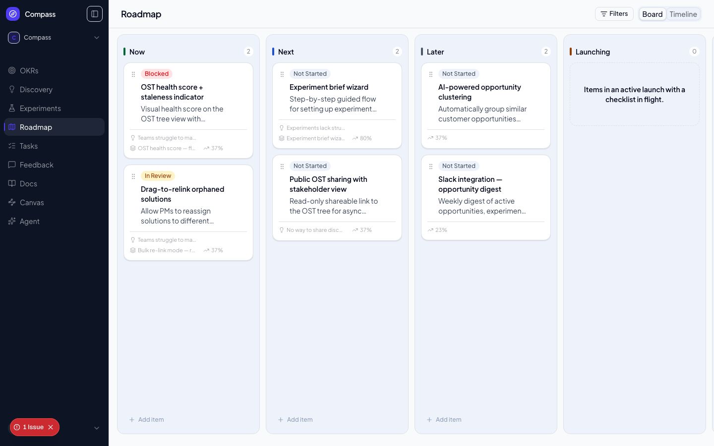
On mobile, each column fills the available board width with small side gutters. Swipe sideways to reach the next column.
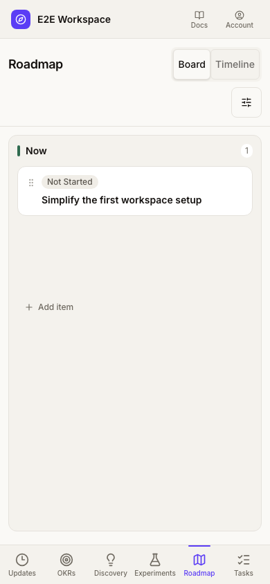
Board swimlanes
Use Group board by in the header to split the Board into horizontal swimlanes — one row per Squad, or one row per option of any single-select custom field on roadmap items. Each lane keeps the same horizon columns, with a sticky header so Now/Next/Later stay visible as you scroll, and ends with a No squad / No <field> lane for items with no value (or a value that no longer exists). Click a lane's header to collapse or expand it; the count shows how many items it holds. Choose No swimlanes to return to the classic board. Multi-select fields aren't offered, since an item could belong to several lanes at once.
Drag a card into another lane to reassign it: the card's squad (or custom-field value) becomes the lane's, and dropping into the No … lane clears it. Dragging also changes the horizon in the same move if you drop in a different column. If the change can't be saved, the card snaps back and a message explains. Dragging an item from Not scheduled into a lane schedules it and sets that lane's value. Launching and Launched remain workflow-managed: dropping there opens the item instead of moving it.
The grouping is part of the page URL (?groupBy=) and of saved views, and the squad filter narrows the squad lanes.
📸 Screenshot: run
pnpm docs:screenshotswith aDOCS_SESSION_FILEto capture this image.
The Four Horizons
- Now — Work that is currently in flight. Your team is actively building or shipping these items. Keep this column short and honest: if it's not genuinely in progress, it belongs in Next.
- Next — Committed work coming up after Now items ship. These items have been prioritised and are ready to start. They have enough detail and justification to begin when capacity opens.
- Later — Directional bets you're exploring but haven't committed to yet. Items here are placeholders for things that are likely important but whose timing and scope aren't settled.
- Shipped — A visible board column of its own (styled with a purple accent, like Now/Next/Later), used to keep a record of completed work. Drag a card into Shipped, or promote it there directly, to mark it delivered without deleting it — so stakeholders can still see what's shipped and trace it back to the opportunity and solution behind it.
WIP Limits (Now / Next)
Optionally set a WIP (work-in-progress) limit for the Now and Next columns in Settings → Delivery limits. Once set, the column header shows count/limit instead of a bare count, and the badge switches to a warning color when the count goes over the limit.
This is purely visual — it's a signal to help the team notice when a column is getting crowded, not a rule the app enforces. Going over the limit never blocks adding a new item or promoting a solution into Now or Next, and there's no confirmation step to override. Leave a limit blank for no limit (the default).
Creating Roadmap Items
Click + Add Item in any horizon column. A roadmap item has:
- Title — What you're building
- Description — Why you're building it
- Horizon — Now / Next / Later
- Linked Opportunity — The customer problem this solves
- Linked Solution — The specific solution approach
- Linked Key Result — The outcome it contributes to
- Linked Experiment — The experiment that validated the approach
- Squad — Team assignment
- Start date / End date — Optional. Leave these blank for items whose timing isn't settled yet — the item still appears on the Timeline as a dashed placeholder bar you can drag to schedule; fill them in (in the item detail, or by dragging the bar) once you know when the work will happen.
- Private — Optional checkbox. Hides the item from the public portal roadmap and blocks voting on it, while still showing it (with a 🔒 Private badge) on the internal Board and Timeline. Use it for items you don't want visible to customers — security fixes, sensitive internal work, anything you'd rather not telegraph externally.
The linked metadata appears as small icon badges on each card, giving stakeholders a quick way to trace the evidence behind each item. A card's Edit menu action (or clicking its title) opens the item's detail, where you can change its title, description, horizon, squad, dates, linked opportunity, or private status. Choose None in the Opportunity picker to remove an existing opportunity link.
Roadmap item detail
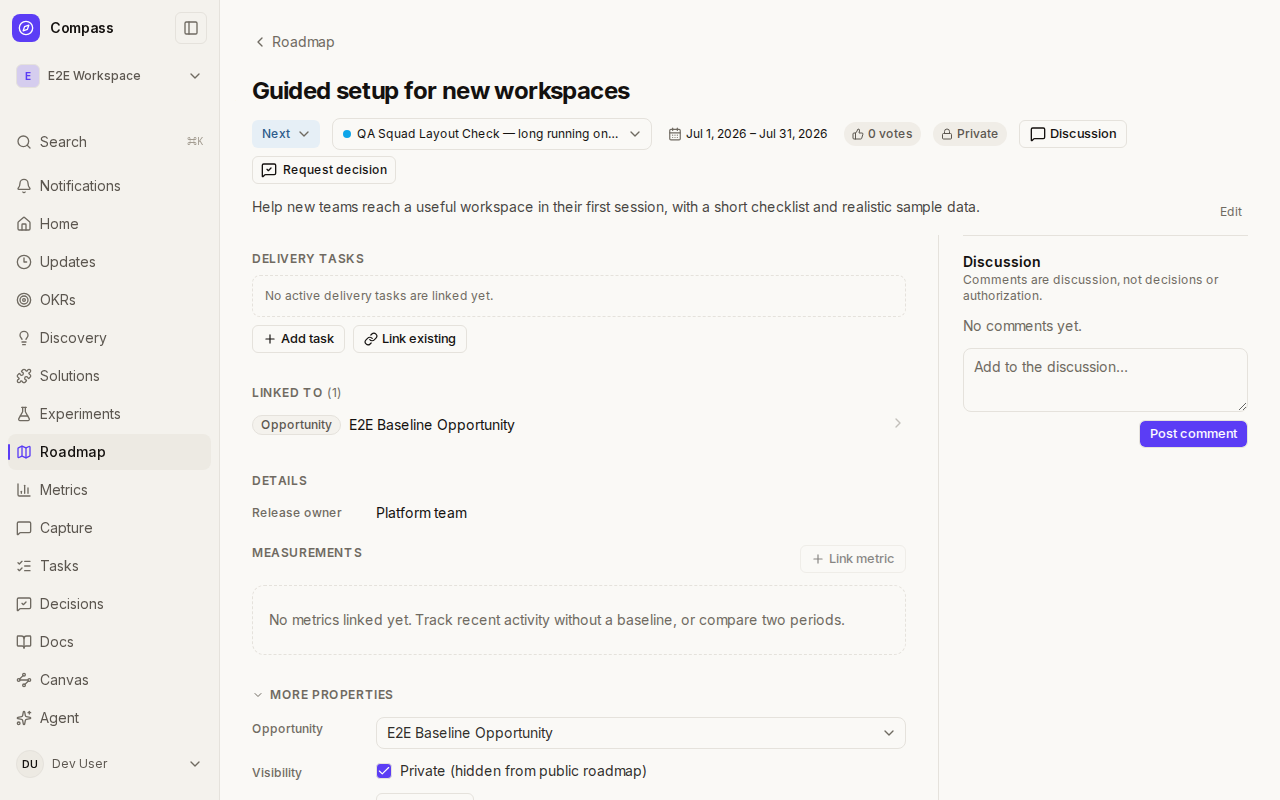
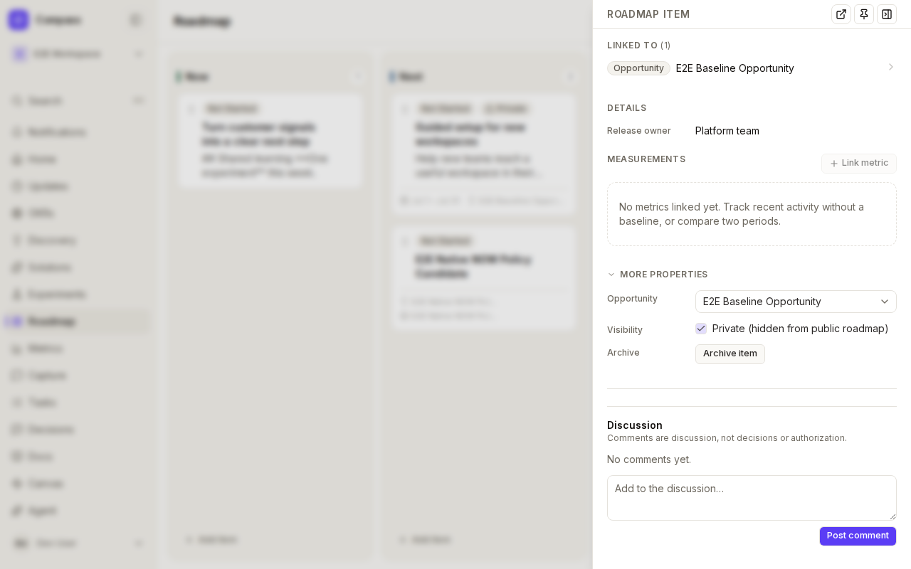
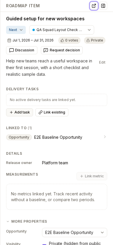
The item detail is one responsive view that appears as a side panel from the board or timeline and as a full page at /roadmap/<item> (use Open full page). Edits save as you make them.
- Summary row — the horizon dropdown, squad, dates, and a vote count sit beside the Discussion shortcut, Follow, and Request decision. A Private chip shows when the item is hidden from the public roadmap, and an Archived chip when it has been archived.
- Dates are an inclusive range: set both a start and an end, or clear both with Clear dates.
- Main sections — Launch (when the marketing-launch workflow is on), Delivery tasks, Linked to, custom fields, and Measurements. Linked to lists the Opportunity, Solution, Experiment, Key Result, and Feedback the item came from; each row opens its panel.
- More properties (collapsed by default) holds the linked Opportunity picker, the Private toggle, and Archive item.
- Discussion sits beside the content on a wide surface and below it on a narrow panel or phone. Layouts scroll rather than squash, so nothing is clipped on a phone.
Private items are visible to workspace members here and on the board; only the public portal hides them. Follow appears once Following is enabled for roadmap items.
Timeline View
Toggle between Board and Timeline at the top of the Roadmap page. Board remains the default. Use Filters beside the view control to focus either view on a squad. The Timeline view is linkable: ?view=timeline takes you straight there, and the squad filter carries over from the Board.
Timeline controls
Every workspace uses the Compass native timeline when you select Timeline. Existing timeline links continue to work, including bookmarks that previously selected the classic renderer.
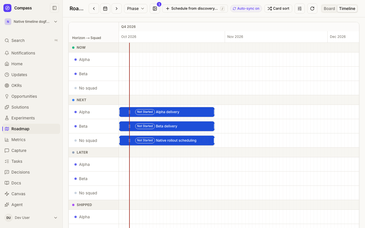
The native chart groups items by horizon and squad by default, with separate tracks for overlapping bars. The Roadmap header contains icon controls for Previous period, Go to today, Next period, and Reload timeline; hover or focus an icon for its tooltip. Open View options to filter by Squad or choose Month / Quarter under Timeline scale. Clear filters clears only the squad filter. On Board, View options contains squad filtering without timeline controls. Scroll the chart horizontally to reach dates outside the visible area.
Timeline grouping
Use the Group by control next to the timeline navigation to change how rows are organized:
- Phase (default) — a header row per horizon (Now/Next/Later/Launching/Launched/Shipped), with squad sub-lanes underneath.
- Squad — one header and lane per squad, plus a No squad group. No horizon rows.
- None — no header rows at all; a flat list of squad lanes across every horizon.
- A custom field — any
SELECT-type custom field defined for Roadmap Item appears in the list. Choosing one groups by that field's values (plus a No value group), with squad sub-lanes underneath, and shows a small badge on each card with its value.MULTI_SELECTfields are not offered, since an item could belong to more than one group.
Grouping is a display choice only: dragging a bar to a new date never changes its horizon, squad, or custom field value except in Phase grouping, where dropping a bar into a different horizon's lane still moves it to that horizon, exactly as before. The choice is saved in the page URL (?groupBy=squad, ?groupBy=none, or ?groupBy=<field id>) so it survives reloads and is shareable; leaving it off, or ?groupBy=phase, uses the default.
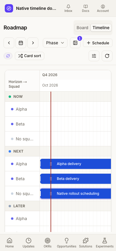
On mobile, the title and Board/Timeline tabs share the first header row; navigation and View options/Reload sit below with larger touch targets. The calendar can scroll horizontally without widening the page.
Timeline scale is retained in the page URL: changing or clearing the squad filter preserves Month/Quarter, and browser Back restores the previous selection.
The native timeline follows your workspace's Light, Dark, or System appearance preference, including its calendar, squad labels, backlog, and date editor. Horizon colors remain consistent across themes.
Drag the dotted move handle just inside a bar's left edge to move its dates. Slim grips on the left and right borders resize the start and end dates; their invisible hit areas are wider than the visible grips and stay separate from the move handle. The compact controls leave more room for the title, which opens the item's details when clicked. Narrow bars hide status and overlap badges to prioritize the title; both remain available to screen readers, and delivery status is also shown in the item's details.
Keyboard controls and an Edit dates dialog offer alternatives to dragging: focus the move handle and use Alt + Left/Right to shift dates, or D to open the date dialog; use Left/Right on either resize grip to adjust that edge. Narrow bars keep the dialog when there is not enough space for separate controls. Dates are inclusive, and changes save immediately. Items without dates use placeholder dates until scheduled. Launching and Launched items are display-only in this chart; use the existing launch workflow to manage them.
Older items with incomplete or invalid dates also appear as placeholders starting today. Their stored dates are not changed by viewing or reloading the timeline. Use Edit dates to explicitly save a corrected schedule.
Use Reload timeline to fetch a fresh snapshot after changes made elsewhere. Reload is disabled while a date save or backlog placement is pending, so it cannot interrupt an active save. The Board tab remains available.
Concurrent edits: an item deleted elsewhere can remain visible during the current session. Conflicting edits disable further editing of the affected item and show reload guidance. Use Reload timeline before continuing; a background refresh is not sufficient. The timeline does not provide live multi-user synchronization.
Not Yet on the Roadmap
Compass surfaces validated or in-delivery Solutions from Discovery, and Bug-type Feedback items, that don't have a roadmap item yet. These are the same items that already have a "Promote to roadmap" action on the Discovery solution card or the Feedback board; this is a second entry point that lets you schedule them without leaving the roadmap.
- On the Board — these candidates live in an always-visible Not scheduled Kanban column after Shipped. Drag a card from it onto any roadmap horizon to schedule it there, or use its ⋯ menu to add it directly to Now/Next/Later without dragging. The column remains visible when empty so the board layout stays consistent.
- On the Timeline — the collapsible Ready to schedule rail beside (or, on narrower screens, above) the chart. See Build the roadmap from Discovery below.
Ideas (as opposed to Bugs) aren't included in the list — they're expected to go through Opportunity → Solution discovery first, same as everywhere else in Compass.
Build the roadmap from Discovery
On the Timeline you rarely need to type a roadmap item. Start from the Solutions and Opportunities you already have, and Compass creates the roadmap item for you. Every item created this way is linked to its Solution (and Opportunity), takes its title, its squad (from the Opportunity) and its key result, and is placed at a suggested slot: the first free stretch in that squad's row on or after today, six weeks long unless the Solution has an effort estimate. Each Solution has at most one active roadmap item, so scheduling something that is already on the roadmap does nothing.
- Show or hide the rail. The panel button next to Schedule from discovery… in the header (Hide ready-to-schedule rail / Show ready-to-schedule rail, or the
[key, ignored while you type in a field) collapses the rail so the chart takes the full width, and brings it back. A small badge on the button shows how many items are waiting in the rail, so you can see there is work to schedule while it is closed; it also notes how many items Auto-sync added. Compass remembers your choice in this browser. Until you choose, the rail is open beside the chart on wide screens (1320px and up) and closed on narrower ones, where it would otherwise push the chart down; open it from the same button and it stacks above the chart. An empty roadmap opens the rail by default. Everything else (the/palette, drawing a range on a row, Build from discovery, Auto-sync and Undo) works with the rail closed; only dragging a card from the rail needs it open. - Ready to schedule rail. The left rail lists validated and in-delivery Solutions that have no roadmap item, grouped under their Opportunity, with status, score and squad chips. Search it, filter by All / Validated / Scored 70+, and click a card's title to open its details. Bug feedback with no roadmap item is listed here too.
- Drag to a row. Drag a card onto a squad row. A ghost bar shows the dates under your pointer and Release to create roadmap item; dropping creates the item in that row's squad starting on that date.
- Schedule button. Every card has a Schedule → button that creates the item at the suggested slot, so the whole flow works from the keyboard.
- Bulk. Tick several cards, then choose Now / Next / Later to schedule them at the start of that horizon, or Auto-fit to place them highest score first in each squad's first free slot.
- Draw a range. Click and drag across an empty part of a row (mouse or pen). Pick a Solution from the Schedule from… popover (the row's squad first, then by score) and it is created over exactly that range.
- Schedule from discovery… (
/). The header button, or the/key anywhere on the Timeline (ignored while you type in a field), opens a command palette over every Solution and Opportunity. Enter schedules the highlighted Solution at the suggested slot, Tab lets you choose a start date and length first, Shift+Enter schedules every unscheduled Solution under that Opportunity, and Esc closes it. Solutions already on the roadmap are shown as scheduled and can't be chosen. - Empty roadmap. A workspace with no roadmap items offers Build from discovery: choose All validated, Top scored (70+) or Currently building and Create N roadmap items to drop a first pass at proposed, non-overlapping slots (highest score first within each squad). Add an item manually shows the blank timeline instead.
- Undo. Every create shows a toast with Undo. Undo archives the new roadmap items; the Solutions themselves are never changed and simply return to the rail.
Auto-sync
Moving a Solution to In delivery (from the Discovery card, its detail panel, the Solutions board, MCP update_solution_status or the API) adds it to the roadmap automatically if it has no roadmap item yet. Validated does not: it stays in the rail as ready to schedule. The header shows Auto-sync on, the bar carries an auto badge, the rail lists it under Auto-added with an Undo, and a toast offers Undo when you made the change.
- The item is added once. If you remove or undo an auto-added item, Compass never adds it back for that Solution, even if its status changes again.
- Removing or archiving a roadmap item never changes its Solution.
- While a linked item hasn't been edited by hand, its title follows the Solution's title, and moving the Solution to In delivery or Shipped moves the item to Now or Shipped (an unstarted item also starts today). Once you edit an item's dates or horizon, its schedule stops following the Solution. Rename the item and its title stops following too.
Drag to Reorder
On touch screens, swipe over card content to scroll vertically or move horizontally between board columns. Use the dotted drag handle to move a card instead. On desktop, column headers stay visible while their cards scroll.
Within each horizon, drag cards to reorder them. Order within a horizon communicates relative priority: items higher in the list are higher priority. This ordering is persisted and visible to all workspace members.
Launch Tiers & Checklists
The marketing-launch workflow — launch tiers, checklists, the LAUNCHING/LAUNCHED horizons, and positioning briefs — is opt-in per workspace via Settings → Marketing launch, and off by default. Most teams don't run a formal marketing-launch process, so the surface stays out of the way until a workspace admin turns it on. With it off, the roadmap-item panel has no Launch section, roadmap cards show no launch chip or menu item, and the board has no LAUNCHING/LAUNCHED columns (any item already in one of those horizons displays folded into Shipped instead).
With the setting on: moving a roadmap item into the Launching phase requires picking a launch tier: Tier 1 (major launch), Tier 2 (minor launch), or Tier 3 (silent launch), from the tier picker in the item's panel or its card's Launch menu action. Setting a tier attaches a checklist cloned from your workspace's active checklist template for that tier, and moves the item to the LAUNCHING horizon. Once launching begins, the item cannot be moved back through the tier-selection step, since the roadmap is tracking a real-world GTM commitment, not just an internal work status.
Checklist templates are workspace-owned and reusable: define one per tier (for example, a Major Launch Checklist for Tier 1 with items like Write launch announcement, Brief support team, and Update pricing page), and every future Tier 1 launch reuses it. Each launch gets its own frozen copy of the checklist at attach time, so editing a template later does not retroactively change checklists already in flight. Checklist items are tracked as Pending, Done, or Skipped, since Skipped exists so a genuinely inapplicable item does not block completion the way an incomplete Pending item would. The item's panel also offers creating a Positioning & Messaging Brief doc alongside the checklist.
Checklist templates themselves (create_checklist_template, list_checklist_templates) are managed via the MCP API — no dedicated template-management UI ships yet.
Saved Views
Save the way you like to look at the roadmap and come back to it with one click. On a workspace roadmap, open the Saved views menu to save the current squad, custom-field filter, grouping and Board/Timeline choice. Opening a saved view applies those settings to the URL, so you can still change or clear any of them afterwards.
Views are personal by default. The owner can share a view with the workspace or the whole organization. Only the owner can edit a view; the owner (or an admin, for shared views) can delete it. Sharing a view never widens access to the items themselves.
All Roadmaps (Cross-Workspace)
All roadmaps in the sidebar opens a read-only roadmap at /[org]/roadmap that combines every workspace in the organization you can read. Filter by workspace, horizon, squad, status, date range, or linked key result or solution, then group and sort the results. Each item links back to its own workspace, where you edit it. The same saved views menu is available here.
Because roadmap and settings are used by these organization pages, they cannot be used as workspace slugs.
Keeping the Roadmap Honest
A roadmap that isn't updated is worse than no roadmap — it creates false confidence. Compass is designed to make updates low-friction: drag to move between horizons, click to update details. The links to opportunities, KRs, and experiments mean the roadmap is always one click away from the evidence behind it.
Public Roadmap (Portal)
If your workspace has Public Roadmap enabled (see Enabling the Portal in Feedback Portal — the same workspace-wide toggle controls both feedback and roadmap visibility), visitors can view your items in three columns — Now (in progress and launching), Coming Up (Next and Later) and Shipped — at /portal/[org]/[workspace]/roadmap and vote on the ones they care about.
Each roadmap card on the portal shows a vote button with the current count. Hovering over a card expands its description if it's been truncated, so visitors can read the full context before voting. Voting follows the same account rules as feedback submission — if Require an account to submit/vote is on, visitors verify their email via magic link (or arrive pre-verified via SSO Identify) before voting; otherwise a name (optional) and email (required) are collected inline.
If Public Feedback is also enabled for the workspace, a Give Feedback link appears in the roadmap page header so visitors can get to the feedback portal without knowing the URL.
Roadmap items marked Private are excluded from the portal entirely — they never appear in the list and the vote API rejects votes on them directly, even if someone learns the item's ID some other way. Private items are still fully visible internally, so use the flag purely as a visibility control, not a way to hide something from your own team.